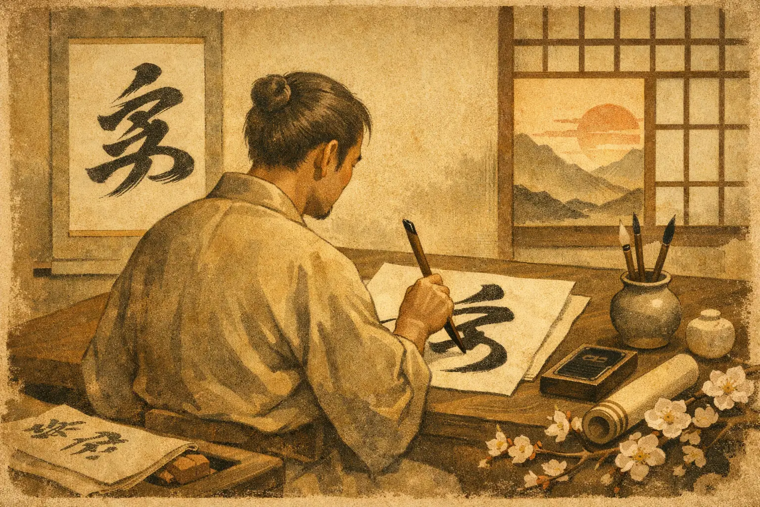
A single black character on white paper can feel startlingly alive: heavy at the start, light at the finish, and surrounded by a silence that seems deliberate. That is the first key to how to appreciate japanese calligraphy. You do not have to read Japanese or know every school of brushwork to feel its energy. You only need to slow down enough to notice that the writing is also a record of movement, mood, and time.
Japanese calligraphy, or shodo, is a wonderful stop for every Japan lover who wants to look beyond the souvenir shelf and closer at the hand behind an artwork. A hanging scroll in a temple, a menu brushed in ink, or a small shikishi card can hold a whole world in just a few strokes.
How to Appreciate Japanese Calligraphy Before Reading It
Start by looking at the work as an image, not a puzzle to decode. Let your eyes travel across the composition. Is the writing tightly gathered or does it sweep across the page? Does it stand upright with formal confidence, or does it lean, race, and nearly dissolve into motion?
The black ink is called sumi, and it is rarely one flat shade. A skilled brush can leave dense, glossy black at the beginning of a stroke and a smoky gray where the ink runs out. This variation is called kasure, or dry-brush texture. It shows the pressure of the hand, the amount of ink, the absorbency of the paper, and the speed of the gesture. What might look unfinished at first is often exactly where the life of the piece appears.
Then look at the empty areas. In Japanese aesthetics, ma is the meaningful interval between things: the pause in music, the space between stones in a garden, the breath around a painted line. In calligraphy, the blank paper is not a background waiting to be filled. It gives the character room to resonate. A bold stroke can feel powerful because of the white space that holds it.
This is why a calligraphy work may appear simple but refuse to feel simple. It asks you to notice balance without making that balance perfectly symmetrical. That quiet irregularity can connect to wabi sabi, an appreciation for imperfection, age, restraint, and the beauty of things that do not last forever.
Follow the Brush, Stroke by Stroke
A calligraphy character is not drawn as an outline. It is built through an ordered sequence of strokes, each made with a brush that responds immediately to pressure and direction. If you can, stand close enough to see where a line begins firmly, turns, pauses, narrows, or lifts away.
Many strokes begin with a small controlled press, then move with confidence. At the end, the calligrapher may stop sharply, taper gently, or flick the brush outward. Those endings are full of personality. They can make the same character seem calm, spirited, formal, playful, or even fierce.
Try tracing the movement with your eyes rather than physically copying it. Imagine the artist standing at the paper. Where did the wrist slow down? Where did the brush carry momentum? Where did the artist commit to one unrepeatable mark? Unlike a printed font, shodo preserves the human instant. Even a highly practiced calligrapher cannot create the identical stroke twice.
This is one reason expressive calligraphy can be more moving than perfectly legible calligraphy. Legibility matters in some settings, such as a formal document or shop sign. But in an artwork, emotional force may matter more. A line that trembles, breaks, or flies off the page can communicate something no tidy typeface can.
Notice the Script Style
You do not need to memorize categories, but recognizing a few common styles helps you see why two works can look completely different. Kaisho is the clear, block-like script often taught to beginners. Its structure makes each stroke easy to identify, and it can feel dignified and steady.
Gyosho, or semi-cursive script, allows strokes to flow into one another. It has movement while remaining fairly readable. Sosho is the more cursive, highly abbreviated style. To an untrained eye, it can resemble a rushing stream of ink. That is part of its appeal, though it may frustrate viewers who expect every character to be instantly recognizable.
You may also encounter kana calligraphy, which uses the flowing Japanese phonetic scripts hiragana and katakana. Kana can feel especially lyrical because of its curved lines and changing rhythm. A work that combines kanji and kana may create contrast between strong, angular forms and softer, more delicate ones.
The trade-off is simple: the freer the calligraphy becomes, the more you may need to release the desire to read every word. Let its rhythm reach you first. Later, ask for a translation or look up the phrase if one is provided. Meaning adds another layer, but it is not the admission ticket.
Look for the Feeling Behind the Words
Calligraphy often presents a single character, a Buddhist phrase, a poem, or a seasonal expression. The content matters. A character for wind, dream, harmony, or heart carries associations that shape the way you see its brushwork. Yet the visual mood should support, complicate, or even challenge the word itself.
For example, a character associated with tranquility may be written in a broad, grounded form with generous ma. A poem about spring may have a lighter rhythm. A Zen phrase may appear spare and direct, almost as if it arrived in one breath. This is not a strict code. Artists make personal choices, and the surprise is often the point.
Seasonality is especially meaningful in Japanese art. A calligraphy scroll displayed in a tearoom might change with the time of year, echoing rain, autumn grass, first snow, or the brief bloom of cherry blossoms. That sensitivity to passing time is close to mono no aware, the tender awareness that beautiful moments are temporary.
When you see a work in a museum, temple, or gallery, check the label for the artist, date, and text. Then return to the image. Knowing that a piece was made by a monk, a courtly poet, or a modern artist can shift your response, but do not let information replace looking. The ink still has to speak for itself.
Appreciate the Materials and the Ritual
Shodo is inseparable from its materials. Traditionally, the calligrapher prepares ink by grinding an ink stick against an inkstone with water. The process takes time, and that time changes the atmosphere before a brush touches paper. The tools are often described as the four treasures of the study: brush, ink, paper, and inkstone.
Washi paper may absorb ink quickly and reveal every hesitation. Silk offers a different surface and can make lines seem more refined. A large brush encourages sweeping gestures, while a small one makes close control possible. The artist is not simply putting words onto a neutral surface. They are responding to a living set of materials.
If you visit a shodo workshop in Japan, pay attention to the quiet before the first mark. The instructor may demonstrate posture, breathing, ink preparation, and the way to hold the brush. The final sheet can take seconds, but the act has been shaped by repeated practice. That contrast is deeply Japanese: discipline creates the freedom for a spontaneous-looking gesture.
At home, you can bring this appreciation into your own routine without pretending to be an expert. Spend five unhurried minutes with one calligraphy image. View it from across the room, then close up. Notice its dark and light areas, follow its motion, and ask what kind of energy it carries. Keep your first response before searching for an explanation.
A Better Way to Bring Calligraphy Home
If you buy a calligraphy piece, choose one because you want to live with it, not because it looks generically Japanese. Ask what the words mean, who made it, and whether it is an original work, a reproduction, or a printed design. None of those options is automatically better. An affordable print can still bring joy, while an original needs care and should be protected from sunlight, humidity, and kitchen grease.
A small piece with a phrase you genuinely connect with often has more staying power than a large work chosen only to fill a wall. Display it where you can give it breathing room. Japanese calligraphy does not need a crowded gallery wall to make an impression. One work, one pause, and a little ma can be enough.
The next time you encounter a brush-written character, resist the urge to glance and move on. Stand with it for one extra breath. Let the line be a line before it becomes language, and you may find a small, vivid connection to the person who made it.